City Pups Website
Helping pups and people find their perfect match in the busy city.

Summary
Background
The dog adoption process can be especially frustrating and difficult for customers who live in big cities. Since many of the adopters will have unique needs, it is especially important that customers are able to find the perfect match for their lifestyle, and high quality of life for the animals. CityPups is a fictional dog adoption startup that targets users who live in large cities, they are looking to build a new web experience for their customers.
My Role
UX/UI Designer
Timeline
5 Day Design Sprint
Tools
Figma, Marvel
Day 1 - Understand & Map
For day one of the Google Ventures design sprint, I reviewed the conducted user research to find the common needs of the target audience. I then brought my notes together to create a map of what our customer’s end-to-end experience would look like when using our product.
Research Notes
Through the conducted user research, a handful of common needs surfaced.
The ability to know how large a dog is expected to get
Knowing the demeanor of a dog, including its energy levels, how loud it is, how comfortable it is with other dogs, and how comfortable it is in crowded places
Being able to quickly see the dog in an active state (through pictures and videos) before scheduling an in-person appointment
The ability to filter for dogs very close by, as many customers only have access to public transportation for travel
To be able to filter for practical matches before seeing all possible emotional matches
Map

Day 2 - Sketch
Day 2 of the sprint focussed on sketching a variety of ideas down on paper to visualize what a potential solution would look like. To gather inspiration for what my solution would look like I spent 30 min performing a lightning demo: taking screenshots, and writing notes on other sites that I liked.
Lightning Demos
I took found inspiration in the pet adoption sites AdoptaPet.com and petfinder. In petfinder, the dogs are clearly visible and are placed front and center. They are nicely spaced, and filters are easily accessible. The clear call to “favorite” some animals is great as well. The second screen shows some filters to help you find a breed that fits your lifestyle. AdoptaPet.com is a popular resource as well. I like the fact that they have you fill out some common filters before seeing a splash page of many potential animals. I also found inspiration on the popular online marketplace Offerup. They feature plenty of specific filters, as well as the ability to filter by price range (which other adoption sites do not).

Crazy 8’s
After creating my user map on day one, and looking at my lightning demo findings for inspiration, I did a Crazy 8s exercise to begin putting pen to paper. I selected the browse screen as the critical screen for users, since this is likely where they will spend the most time during their search. This is also where the most condensed information is presented, so it is important that is organized in a clear and legible way. Crazy 8s involves creating 8 sketches in 8 minutes. It isn’t pretty, but it is effective.
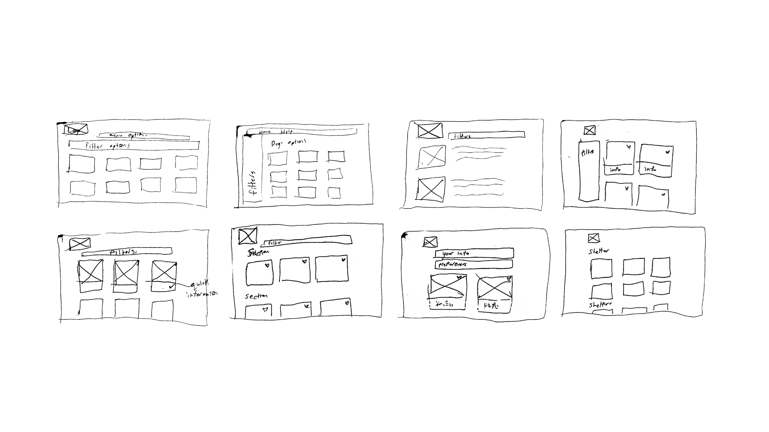
Solution Sketches
After selecting the most promising sketch from the crazy 8s exercise, I sketched the screen with a bit more detail, and also sketched the screens before and after that critical screen to begin to visualize more of the process.

Day 3 - Storyboard
I spent day 3 of the sprint creating a storyboard of the users experience using the CityPups site. Using my solution sketches from day 2 as a starting point, I fleshed out more of the screens users would go through, and what actions would need to be performed from start to end.
Storyboard Steps
The story board moves as such:
User performs a search for “Dogs for adoption” on a search engine, and selects City Pups site
User decides between browsing and finding a “match” for them, user opts to find a match
User answers a series of questions about their own lifestyle
User answers a series of questions about their optional preferences for a dog
User views all available matches
User selects and views a dogs profile to learn more about them
User seeks to learn more information about adopting and meeting the dog, so is taken to the adoption agencies profile
Storyboard

Day 4 - Prototype
Day 4 of the design sprint was dedicated to prototyping my solution. Because of the time constraints of the sprint, this prototype is not as fleshed out as normal prototypes are, and is built for the sole purpose of getting user feedback to continue to iterate further. I prototyped the screens using Marvel, for its’ ease of use and efficiency at rapid prototyping.

Day 5 - Test & Iterate
The last day of a design sprint was dedicated almost entirely to gathering user feedback. I interviewed 4 potential users, who all live in major urban areas, and are interested in pet adoption. I had them go through the process start-to-finish, and say their thoughts along the way.
Through these tests, I identified three areas of change.
On the home screen, most users instinctively clicked “Browse Pups” instead of the “Find your Match” option
Since the company wants to drive its users to the match function, I changed the colors to put more emphasis on that option
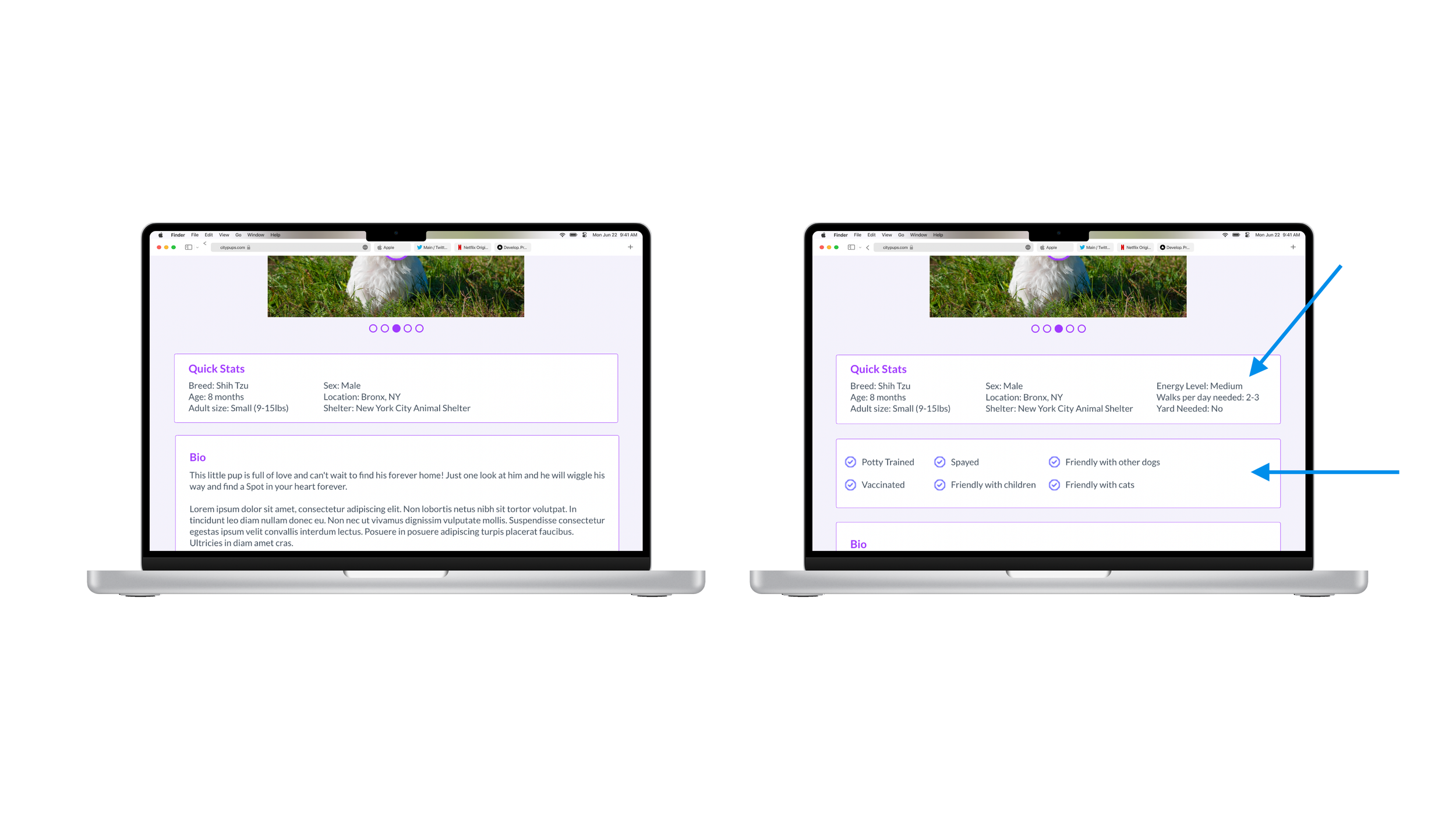
Although users inputted their preferences, it wasn’t clear why any given dog matched with them.
To help reduce confusion, I added more “quick facts” to the dog’s profile to clarify the needs/attributes of the dog more minutely
The “How to Adopt” button on the dog page that is meant to drive users to move forward in the adoption process was a bit vague
I changed the button to read “Meet [dog’s name]” although more copy would likely need to be tested to find the best option
Before
After

Conclusion
This design sprint ended up producing a successful proof of concept for the City Pups website in 5 days of work. Design sprints are a fantastic way to get ideas out, to fail fast, and succeed sooner. The usability adjustments to made through the first round of testing went a long way to cleaning up the interface, and providing users with clearer information on pups. In the next sprints, I would look deeper into what “quick stats” users would like to see, what questions are relevant to ask users when going through the “find your match” flow, as well as further explore the possibility of booking meet & greet times through the platform, without pushing users out of the site. This would simplify users’ adoption journeys, as well as make the job of adoption centers easier.