
Newsie Mobile App
A different type of news app, optimized for content sharing and community building.
My Role
Lead UX/UI Designer
Tools: Figma, FigJam, Marvel, Miro
Timeline: 3 Months
The Challenge: Credibility vs. Connectivity
Modern news consumption is inseparable from social media, yet the two rarely coexist efficiently. Social platforms excel at engagement but often lack the structure for deep news consumption, while traditional news sites struggle to foster authentic community.
The Strategy: A Community-First News Ecosystem
I designed Newsie to bridge this gap—a product optimized for content sharing and community building that doesn't sacrifice the integrity of the news itself. My goal was to move beyond the "comment section" and create a platform where sharing ideas is the primary engine of discovery.
Discovery & Insight
Uncovering the Social Motivation for News
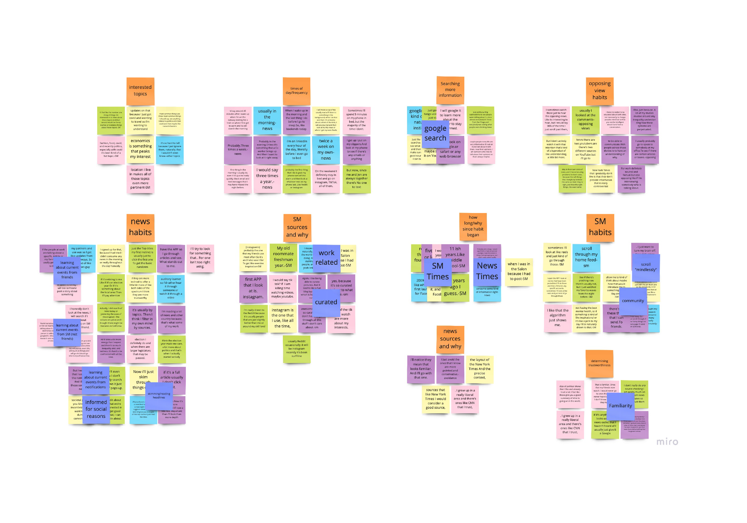
My research confirmed that 53% of U.S. adults rely on social media for news. However, the real "Aha!" moment came from synthesizing 106 unique data points from user interviews : Being informed is often a socially motivated act.
Key Strategic Insights:
The Power of Summaries: Quick updates are just as valuable to users as deep-dives, especially for those "on the go".
The Conflict of Viewpoints: Users value a high-level understanding of opposing viewpoints but find the current delivery of those views intrusive or polarizing.
Actionable Curation: "Share" tools are among the most-clicked elements on news sites, proving that users want to use news as a social currency.
The Pivot: Framing the Challenge
To bridge the gap between research and the interface, I developed three "How Might We" statements to serve as my North Star:
HMW foster community within a news environment without compromising credibility?
HMW deliver high-impact news summaries that encourage active discussion?
HMW expose users to diverse perspectives in a way that feels helpful rather than confrontational?
Strategic Prioritization
Defining the Minimum Viable Experience (MoSCoW)
To manage the complexity of combining news and social features, I used the MoSCoW method to ruthlessly prioritize the roadmap:
Must Have (Core Value): Community opinions, curated feeds, and summaries to ensure immediate user utility.
Should Have (The Differentiator): Access to opposing POVs—a critical feature for reducing echo chambers, though secondary to core navigation.
Strategic Trade-off: I moved "Deep Dives" and "Mediums" to the "Won't Have" (or "Future") list for the MVP to focus on perfecting the social-summary loop.
Iterative Exploration
From Low-Fidelity to Logic
I used rapid sketching and wireframing to explore various layouts for the Summary Feed and Community modules. My focus was on finding a balance between "Information Density" and "Interactive Ease."
Key Decision: I moved away from text-heavy traditional news layouts in favor of an icon-driven navigation system. This reduced the cognitive load reported by users during the discovery phase.

Low Fidelity Prototype

The Design Solution
Managing Cognitive Load through Visual Hierarchy
The primary design challenge was merging two information-dense worlds (Social + News) without overwhelming the user.
Breathing Room: I utilized intentional white space and "visual breathing room" to ensure that dense news headlines didn't compete with social interactions.
Iconography over Text: By letting images and icons drive the primary navigation, I reduced the cognitive load required to scan the feed.
Multi-Persona Paths: I designed distinct "Happy Paths" for our three core archetypes: Informed Isabelle (The Power User), Social Santiago (The Connector), and Busy Bailey (The Casual Consumer).
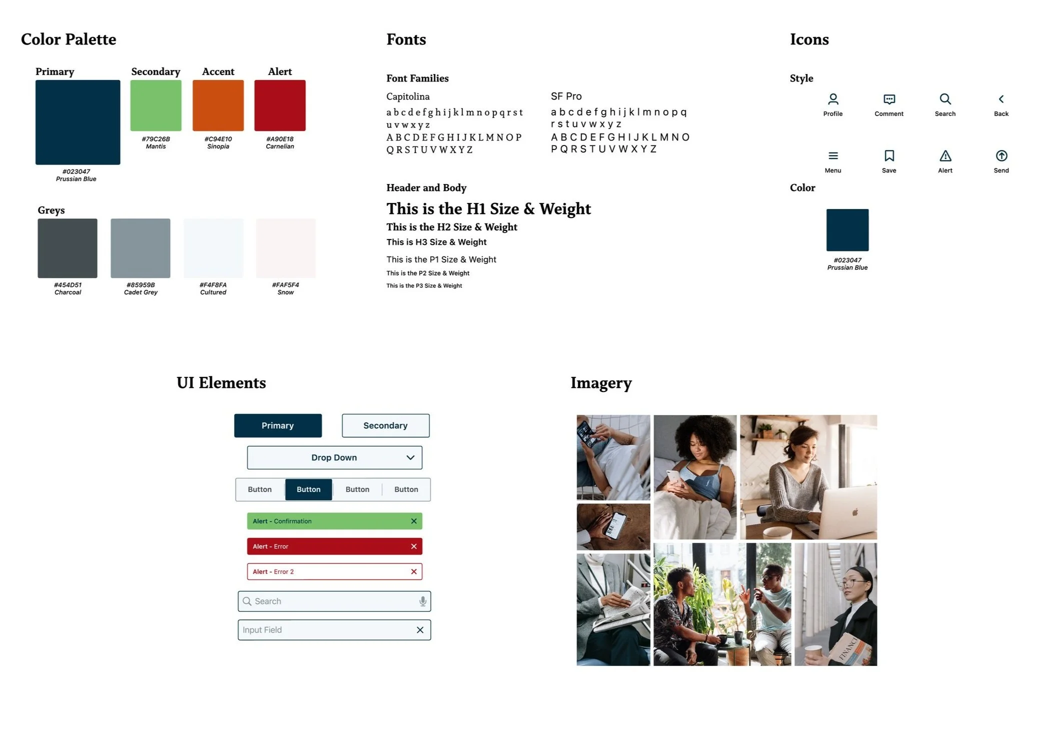
Style Guide
High Fidelity Prototype
Impact & Future Vision
Validation & Next Steps
User testing revealed high excitement for a unified interface that treats "comments" and "articles" with equal weight.
If I were to scale this today, I would focus on:
Measuring Sentiment: Tracking the ratio of "meaningful social interactions" vs. "passive scrolling."
Algorithmic Transparency: Designing a UI that clearly explains why a certain "opposing POV" is being shown to the user.
Monetization Strategy: Exploring how community-supported news models could replace traditional, intrusive ad-tech.
After various rounds of guerrilla testing and iterating, the prototypes were ready for a fresh coat of paint. I worked on a style guide, applied it, and after some more tinkering and testing, settled on high-fidelity prototypes.